2021 ∙ Personal project
Registry of Marriages
Introduction
I’ve always been interested in making everyday services that people rely on to complete important tasks more easy, accessible and efficient to use. I embarked on a personal project to redesign the Registry of Marriages (ROM) website to enable couples to register for marriage in Singapore easily and confidently.
This project is not affiliated with the Registry of Marriages (ROM) Singapore, and was done out of personal interest.
Project info
Role
Product designer
Duration
Sep 2021, 3 weeks
Skills
User research, interaction design, visual design
Overview
Problem
How might we make the process of marriage registration more straightforward, relevant and reassuring for couples getting married in Singapore?
Outcome
A redesigned website experience that enables couples to easily find information that’s relevant to them for each stage of the marriage process, helping them feel prepared and confident as they plan for marriage.
Solution
Home page
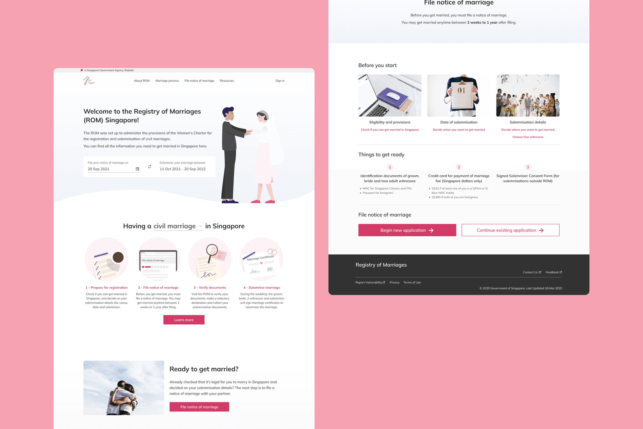
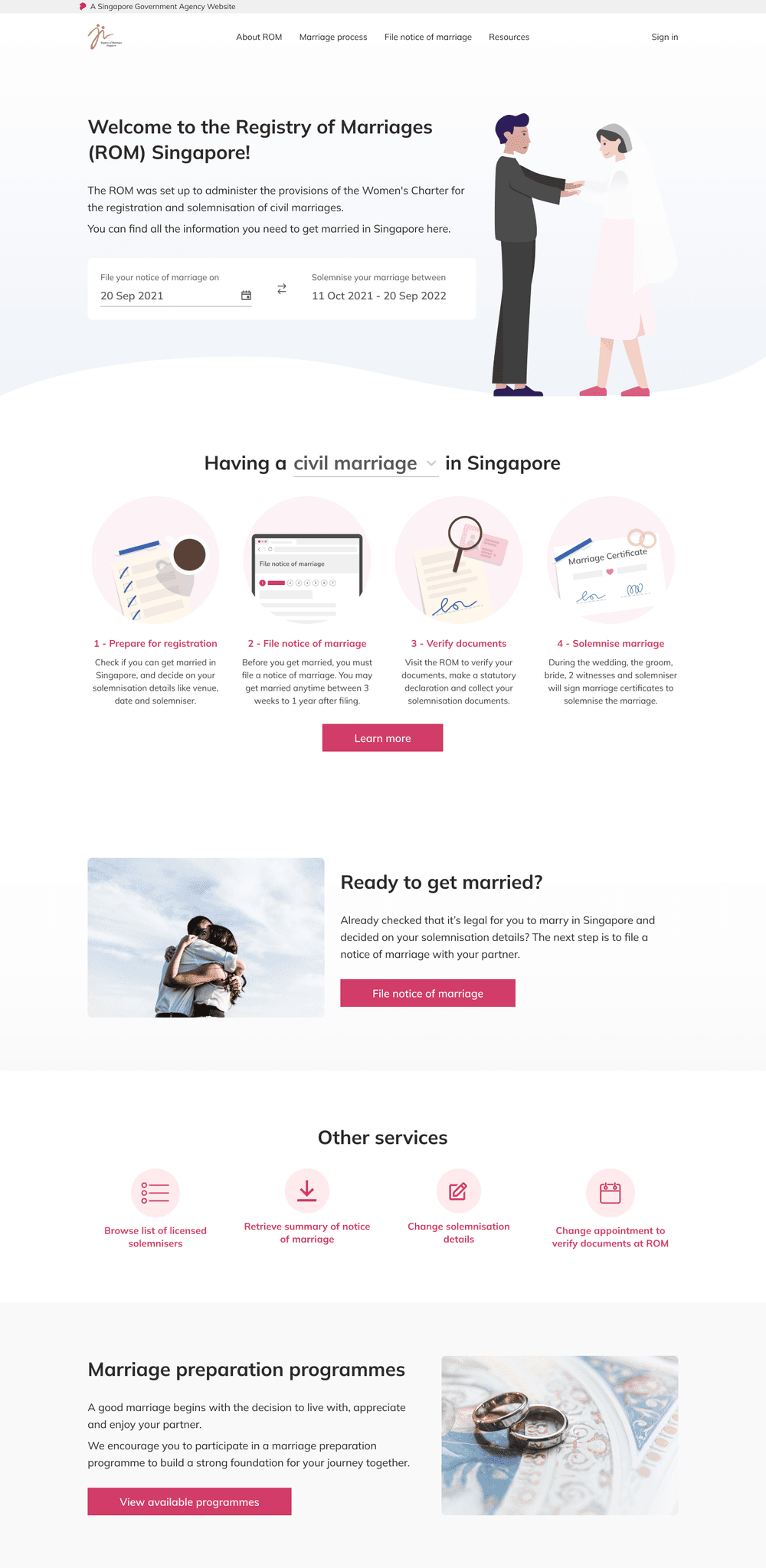
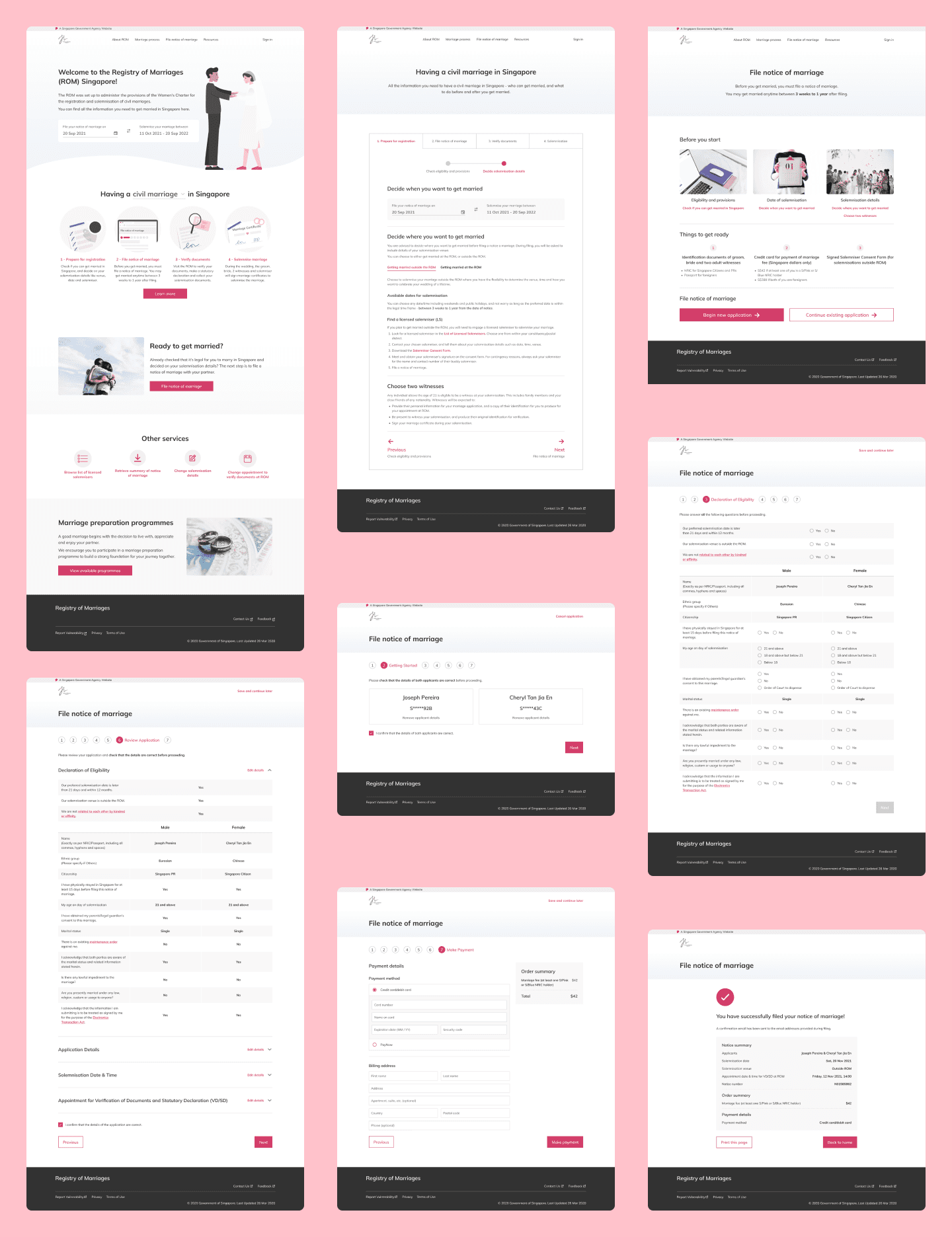
On the new home page of the ROM website, information is organised with the intent to help users find what they’re looking for easily.
Couples who are planning to get married can get a quick idea of their solemnisation window and view a summary of the things they need to do at each step of the process.
Those who are already midway through the process can easily navigate to specific services depending on their needs.
Marriage process
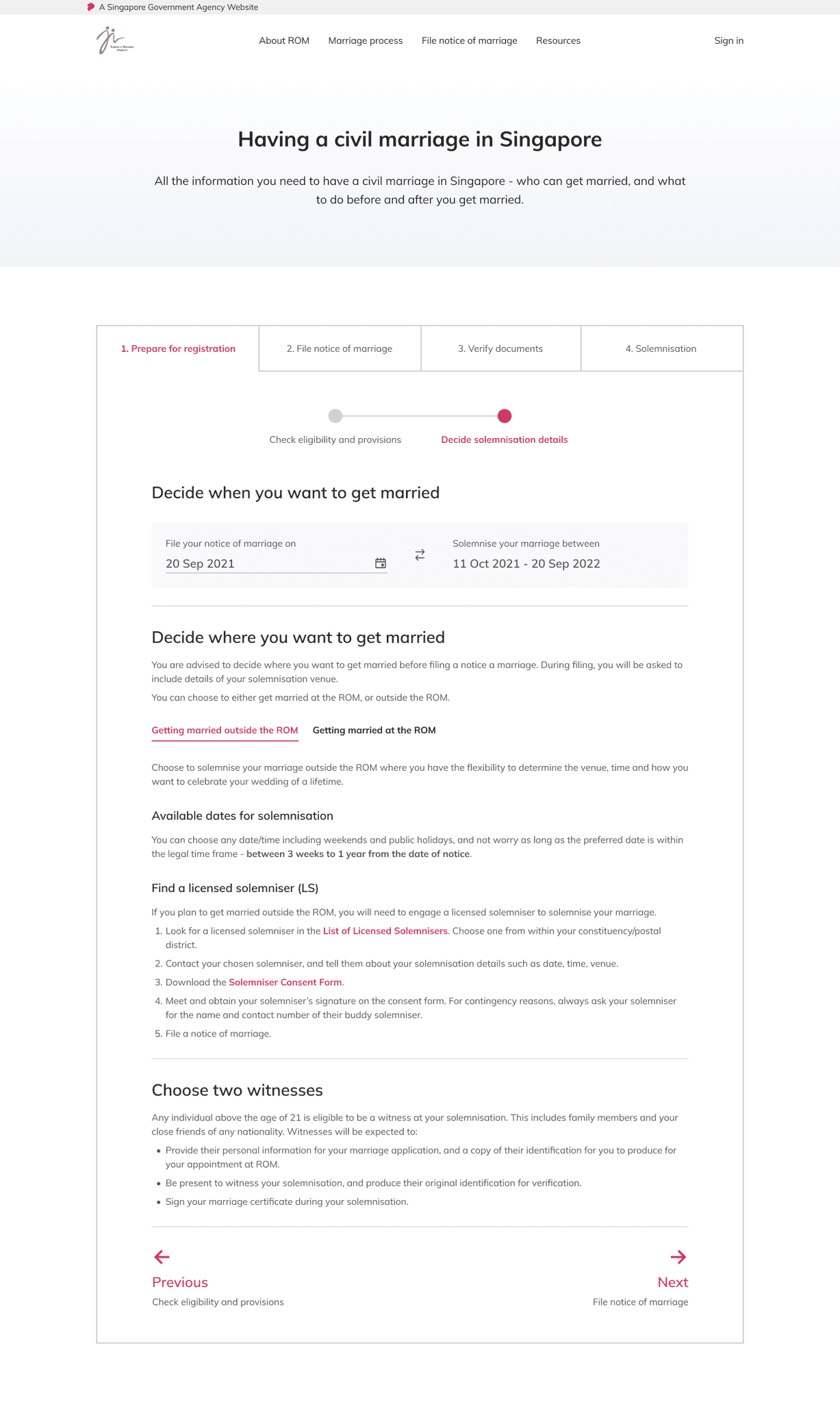
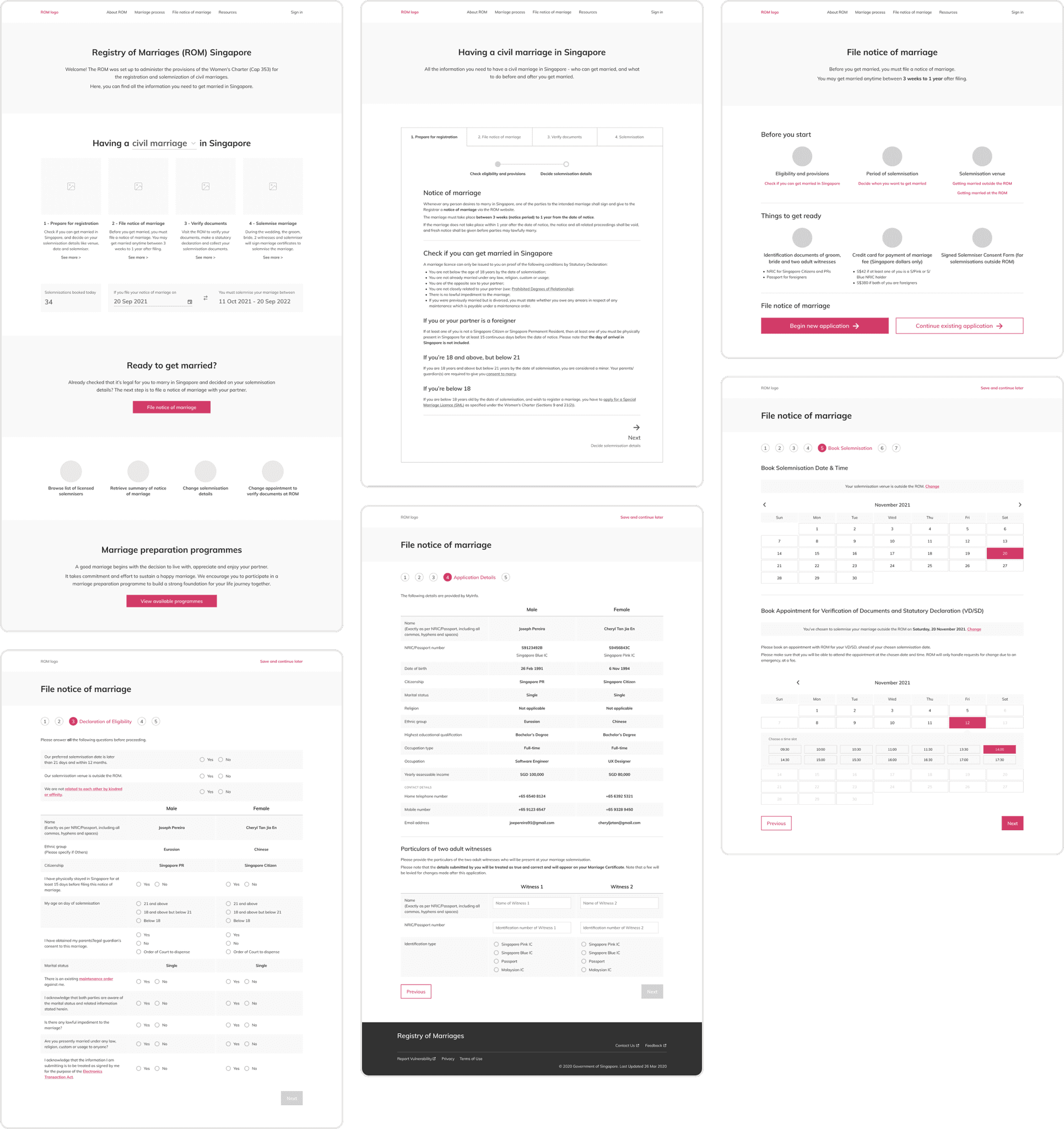
Information about each step of the marriage process is progressively disclosed using tabs. The idea is to guide users through the process in a focused way. At each step, they are given just enough information to act on before moving to the next.
The key things to do for each step are further organised into sections for easy scanning, and users can hide or show information depending on specific conditions that are applicable to them.
File notice of marriage
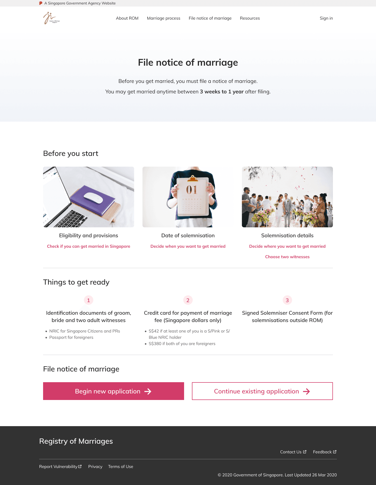
Before couples file a notice of marriage, they are reminded of what they need to know and do with quick links to relevant information.
They can begin a new application, or continue an existing application from their saved progress by signing in to their account.
Filing process
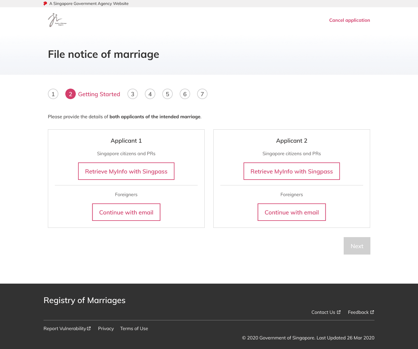
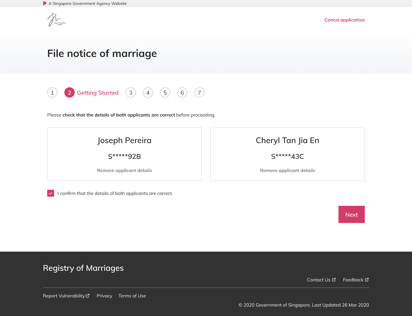
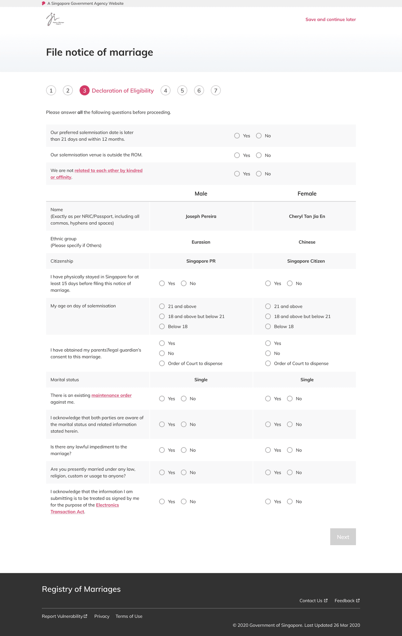
During the filing process, users can create an account on the website with Singpass, a national digital identity platform for Singapore residents, or email.
As part of the improved form-filling experience, relevant form fields will be auto-filled for them using Singpass, and they can also save their progress and return to the application later.
Problem discovery
The Registry of Marriages (ROM) website is a one-stop portal that aims to serve the needs of couples who want to register their marriage in Singapore. While it is an important source of information for couples planning to get married, there were clear limitations to the website.
To better understand the problem, I relied on discovery methods including interviews, a thorough audit of the website itself, competitor research, and journey mapping of the existing marriage process.
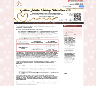
The website is dated and in need of a revamp to meet current design and accessibility standards
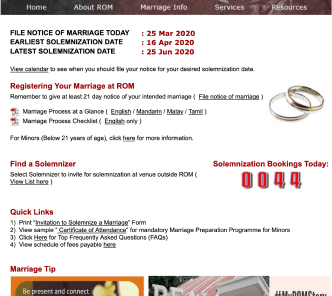
It is difficult for users to navigate and find the information they need to register their marriage
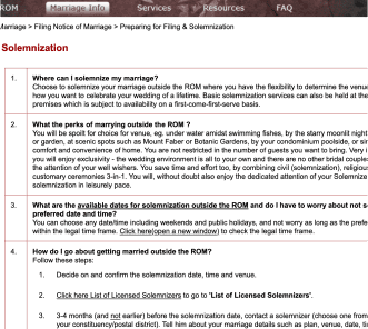
Users are not sure what to do with the information, as requirements can differ by type of couple
I conducted semi-structured interviews with 5 couples about their experience planning for marriage. Three key themes emerged:
Couples had to sift through large amounts of information to find what they are looking for
“First of all there’s a lot of info. I guess I sort of like that you can find all of it online, but it’s very difficult to find it sometimes.”
“Apparently they provide a checklist for marriage, but now I’m not even sure where it is. So the Marriage Info page is like a Q&A section. To me it’s all over the place - solemnisation info, filing info, prep info…”
Yet they did not always have correct or relevant information at each step of the marriage process
“When we were filling the form, we kept going to the FAQ page to check, and when we went back it timed out, so we wound up filling it 4-5 times.”
“While filing our notice of marriage, we realised we were mistaken – thought we may only file the notice up to three months before solemnisation, but actually it was up to a year before.”
Planning for marriage is a process that involves many moving parts beyond just registration
“It was challenging as we had to source for vendors and venues, and go down to review them – more time-consuming and costly in that sense.”
“There’s a lot to think about, like procuring your witnesses, and you also need their personal details and if you need to change them later on you need to pay a fee.”
Ideation
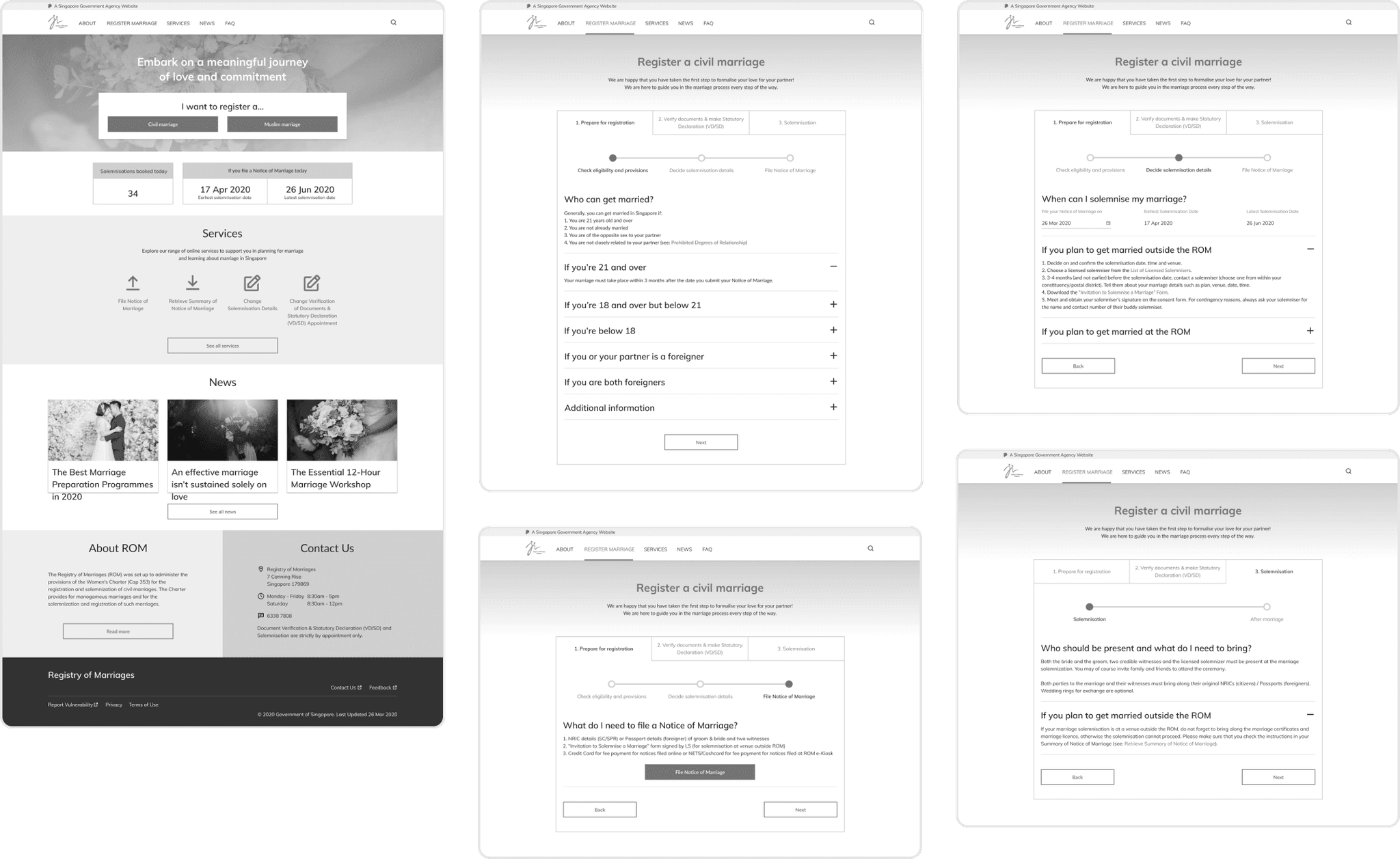
While ideating over potential solutions, I used sketches to explore different layout concepts and ways to improve the website's information architecture. Then, I created low-fidelity wireframes to better visualise different interactions and flows between pages.
This stage was also where I referred to other similar government websites for inspiration, with a focus on identifying standards and patterns that could translate well to the redesigned experience.
Iteration
After coming up with the initial set of wireframes, I translated the insights from the interviews into key design principles that informed the next stage of the redesign.
Straightforward
Simplify and organise information to make it easy for couples to read, understand and navigate to find what they need
Relevant
Provide information that is relevant to each couple’s unique context, for each step of the marriage process
Flexible
Allow users to sort out details and make any necessary changes as part of marriage registration
I went over the wireframes multiple times, iterating throughout, while also exploring how certain key transactions like filing a notice of marriage could be streamlined. Then, I added the finishing visual touches and converted the wireframes into high-fidelity design mockups.
Design snapshot
Journey mapping
Through my semi-structured interviews, I learned more about each couple’s unique wedding planning journey and the pain points they faced. This helped me to visualise the series of interactions they had – not just with ROM, but also other channels such as the vendors and venues that they engaged for their weddings.
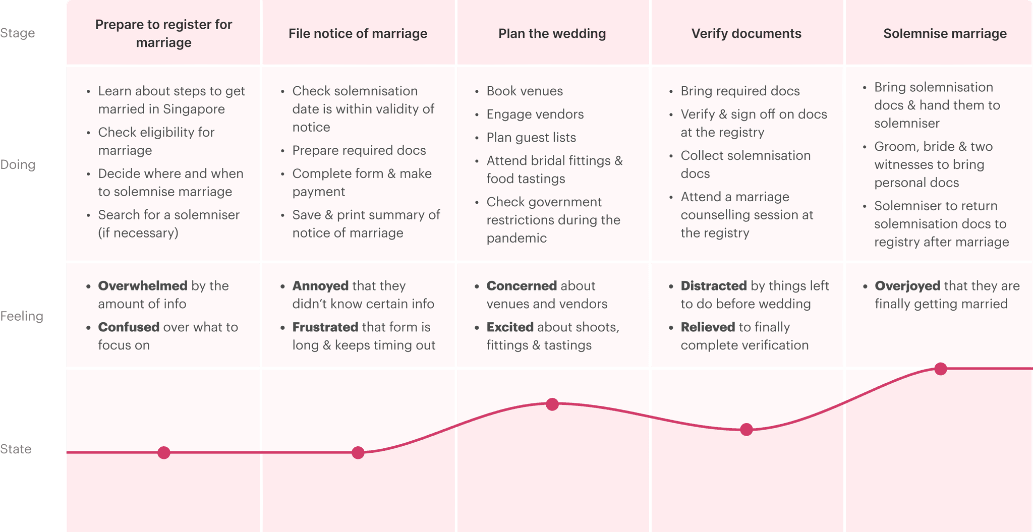
Mapping out the end-to-end journey revealed several gaps in the experience. Some interesting findings include:
Some couples were frustrated that their appointment with ROM to verify their documents was automatically scheduled to happen just 1 week before their solemnisation date, but they were unable to change it.
Some couples also wished that they could easily get in touch with ROM to check on urgent issues ahead of their solemnisation.
After filing their notice of marriage, some couples mentioned not interacting with ROM at all while planning for their wedding, resuming contact only when it was time to verify their documents.
These gaps represent opportunities for ROM to improve service delivery across multiple areas including product, operations and customer service, many of which likely cannot be solved by a website redesign alone.
Conclusion
Any of the following outcomes could suggest that the redesign was successful:
Users take less time to find specific information about the marriage process in Singapore
More users successfully file a notice of marriage in a single attempt
Users take less time to file a notice of marriage
Users feel more confident in finding information about the marriage process, and filing a notice of marriage
Improvements in attitudes and perceptions towards the ROM website
This project has focused mainly on improving the information architecture, organisation and usability of the ROM website, and modernising it to better suit the needs of couples in Singapore today.
Moving forward, it would be great to have the opportunity to speak with the team at ROM to better understand the registry’s goals for the website, validate the insights from my user research study, and create a roadmap for incremental product improvements based on a good understanding of organisational and user needs.
2021 ∙ Personal project
Registry of Marriages
Introduction
I’ve always been interested in making everyday services that people rely on to complete important tasks more easy, accessible and efficient to use. I embarked on a personal project to redesign the Registry of Marriages (ROM) website to enable couples to register for marriage in Singapore easily and confidently.
This project is not affiliated with the Registry of Marriages (ROM) Singapore, and was done out of personal interest.
Project info
Role
Product designer
Duration
Sep 2021, 3 weeks
Skills
User research, interaction design, visual design
Overview
Problem
How might we make the process of marriage registration more straightforward, relevant and reassuring for couples getting married in Singapore?
Outcome
A redesigned website experience that enables couples to easily find information that’s relevant to them for each stage of the marriage process, helping them feel prepared and confident as they plan for marriage.
Solution
Home page
On the new home page of the ROM website, information is organised with the intent to help users find what they’re looking for easily.
Couples who are planning to get married can get a quick idea of their solemnisation window and view a summary of the things they need to do at each step of the process.
Those who are already midway through the process can easily navigate to specific services depending on their needs.

Marriage process
Information about each step of the marriage process is progressively disclosed using tabs. The idea is to guide users through the process in a focused way. At each step, they are given just enough information to act on before moving to the next.
The key things to do for each step are further organised into sections for easy scanning, and users can hide or show information depending on specific conditions that are applicable to them.

File notice of marriage
Before couples file a notice of marriage, they are reminded of what they need to know and do with quick links to relevant information.
They can begin a new application, or continue an existing application from their saved progress by signing in to their account.

Filing process
During the filing process, users can create an account on the website with Singpass, a national digital identity platform for Singapore residents, or email.
As part of the improved form-filling experience, relevant form fields will be auto-filled for them using Singpass, and they can also save their progress and return to the application later.


Problem discovery
The Registry of Marriages (ROM) website is a one-stop portal that aims to serve the needs of couples who want to register their marriage in Singapore. While it is an important source of information for couples planning to get married, there were clear limitations to the website.
To better understand the problem, I relied on discovery methods including interviews, a thorough audit of the website itself, competitor research, and journey mapping of the existing marriage process.

The website is dated and in need of a revamp to meet current design and accessibility standards

It is difficult for users to navigate and find the information they need to register their marriage

Users are not sure what to do with the information, as requirements can differ by type of couple
I conducted semi-structured interviews with 5 couples about their experience planning for marriage. Three key themes emerged:
Couples had to sift through large amounts of information to find what they are looking for
“First of all there’s a lot of info. I guess I sort of like that you can find all of it online, but it’s very difficult to find it sometimes.”
“Apparently they provide a checklist for marriage, but now I’m not even sure where it is. So the Marriage Info page is like a Q&A section. To me it’s all over the place - solemnisation info, filing info, prep info…”
Yet they did not always have correct or relevant information at each step of the marriage process
“When we were filling the form, we kept going to the FAQ page to check, and when we went back it timed out, so we wound up filling it 4-5 times.”
“While filing our notice of marriage, we realised we were mistaken – thought we may only file the notice up to three months before solemnisation, but actually it was up to a year before.”
Planning for marriage is a process that involves many moving parts beyond just registration
“It was challenging as we had to source for vendors and venues, and go down to review them – more time-consuming and costly in that sense.”
“There’s a lot to think about, like procuring your witnesses, and you also need their personal details and if you need to change them later on you need to pay a fee.”
Ideation
While ideating over potential solutions, I used sketches to explore different layout concepts and ways to improve the website's information architecture. Then, I created low-fidelity wireframes to better visualise different interactions and flows between pages.
This stage was also where I referred to other similar government websites for inspiration, with a focus on identifying standards and patterns that could translate well to the redesigned experience.

Iteration
After coming up with the initial set of wireframes, I translated the insights from the interviews into key design principles that informed the next stage of the redesign.
Straightforward
Simplify and organise information to make it easy for couples to read, understand and navigate to find what they need
Relevant
Provide information that is relevant to each couple’s unique context, for each step of the marriage process
Flexible
Allow users to sort out details and make any necessary changes as part of marriage registration
I went over the wireframes multiple times, iterating throughout, while also exploring how certain key transactions like filing a notice of marriage could be streamlined. Then, I added the finishing visual touches and converted the wireframes into high-fidelity design mockups.

Design snapshot

Journey mapping
Through my semi-structured interviews, I learned more about each couple’s unique wedding planning journey and the pain points they faced. This helped me to visualise the series of interactions they had – not just with ROM, but also other channels such as the vendors and venues that they engaged for their weddings.

Mapping out the end-to-end journey revealed several gaps in the experience. Some interesting findings include:
Some couples were frustrated that their appointment with ROM to verify their documents was automatically scheduled to happen just 1 week before their solemnisation date, but they were unable to change it.
Some couples also wished that they could easily get in touch with ROM to check on urgent issues ahead of their solemnisation.
After filing their notice of marriage, some couples mentioned not interacting with ROM at all while planning for their wedding, resuming contact only when it was time to verify their documents.
These gaps represent opportunities for ROM to improve service delivery across multiple areas including product, operations and customer service, many of which likely cannot be solved by a website redesign alone.
Conclusion
Any of the following outcomes could suggest that the redesign was successful:
Users take less time to find specific information about the marriage process in Singapore
More users successfully file a notice of marriage in a single attempt
Users take less time to file a notice of marriage
Users feel more confident in finding information about the marriage process, and filing a notice of marriage
Improvements in attitudes and perceptions towards the ROM website
This project has focused mainly on improving the information architecture, organisation and usability of the ROM website, and modernising it to better suit the needs of couples in Singapore today.
Moving forward, it would be great to have the opportunity to speak with the team at ROM to better understand the registry’s goals for the website, validate the insights from my user research study, and create a roadmap for incremental product improvements based on a good understanding of organisational and user needs.